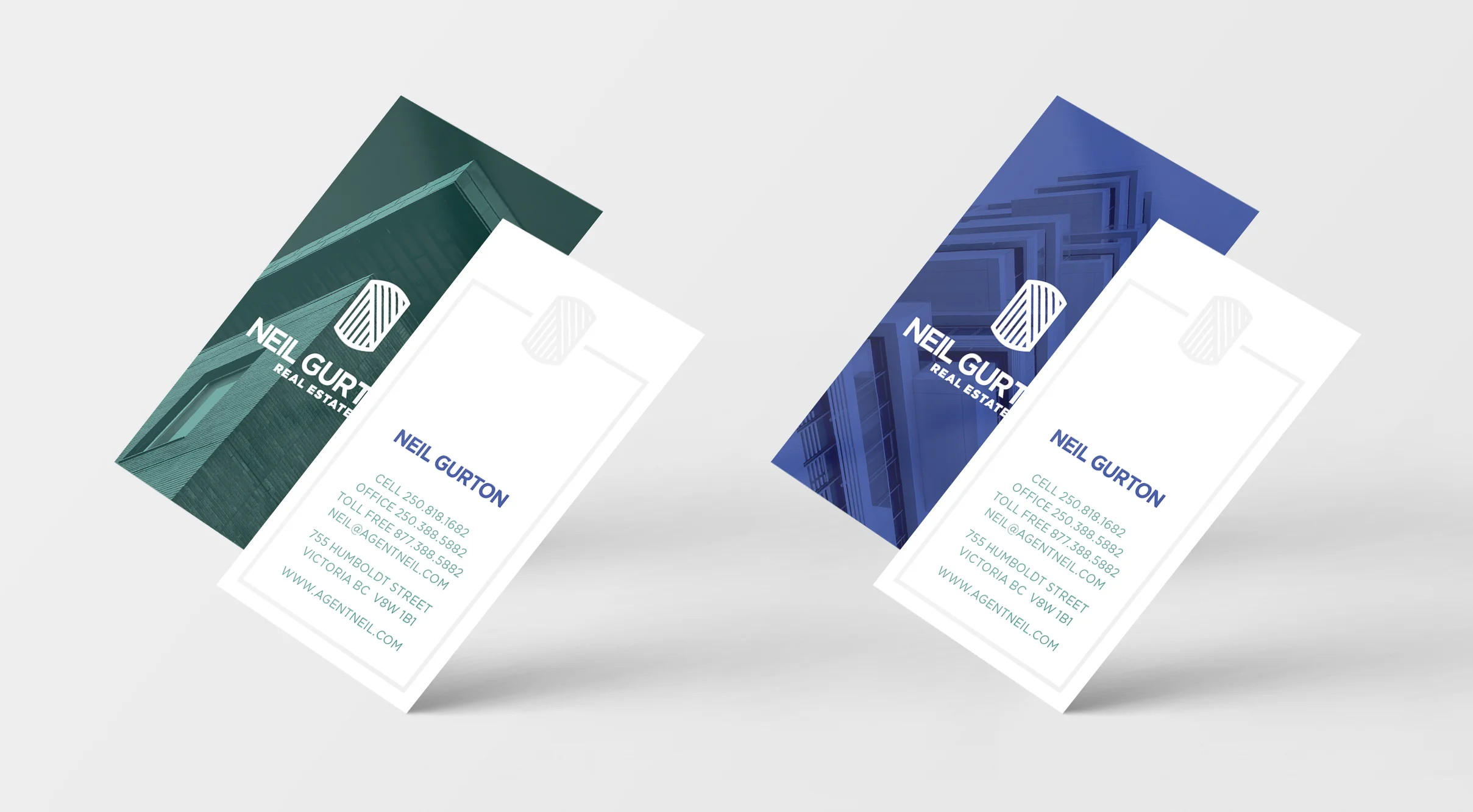


Neil is a real estate professional with a decade of experience in the Greater Victoria area. For his personal brand, Neil wanted a new logo that spoke to his experience, but didn’t fall victim to the classic real estate logo clichés.
To that end, Neil and I worked together to create a unique crest that incorporated an N for Neil, and two sets of stripes which related to elements of real estate: hardwood flooring and window dressings. A simple pattern repeat was also created with Neil’s icon to serve as a beautiful back side of his letterhead.
I also worked closely with a local print shop to create beautifully printed business cards, thank you cards and letterhead. A blind spot varnish used subtly across the entire package elevated Neil’s brand even further.