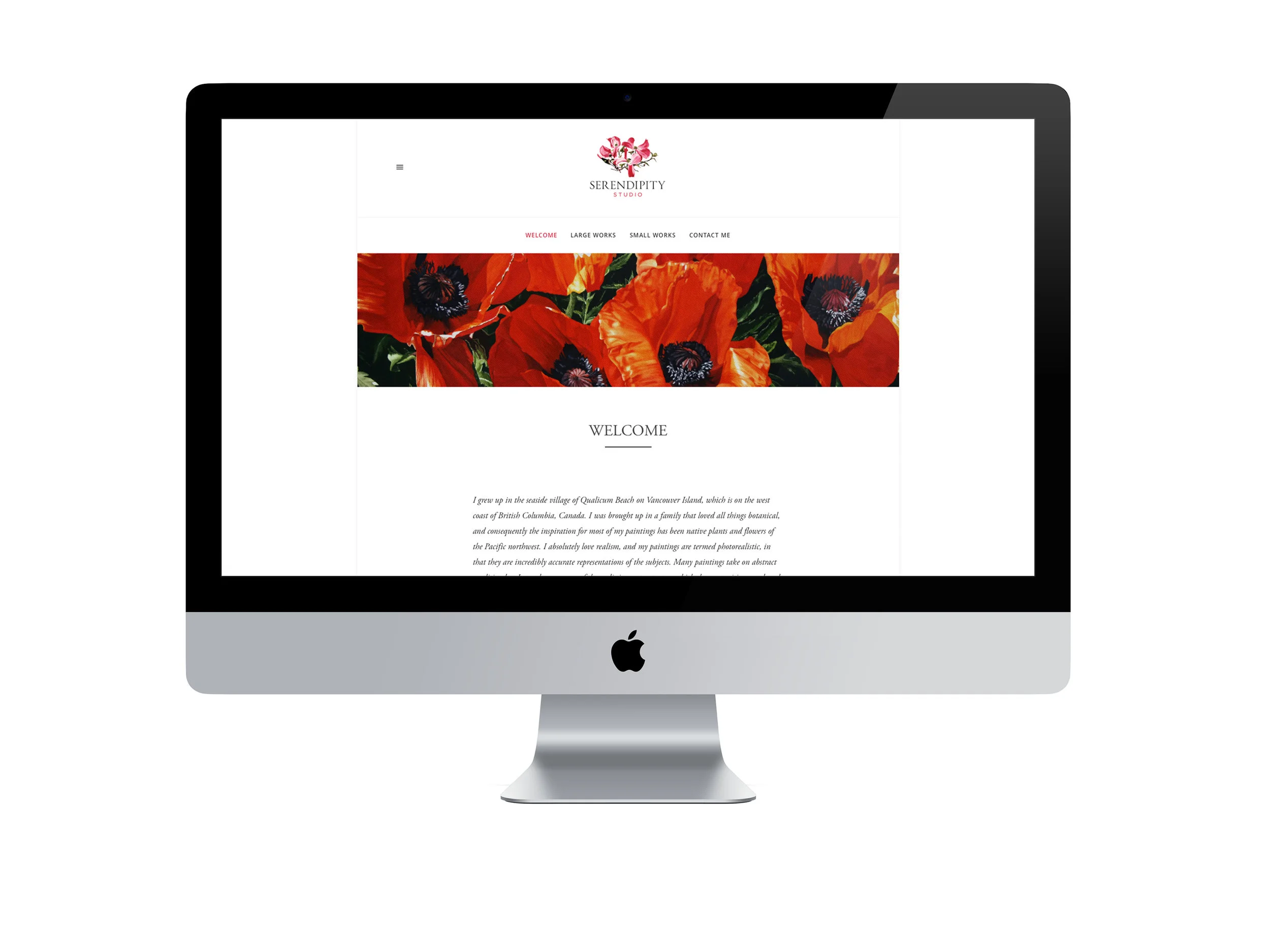
When you have an artist as talented as Sherry Mitchell, (yes, she’s my mom!) I felt it was absolutely vital to use a piece of her original artwork to brand her studio. Sherry’s subject matter is primarily photorealistic watercolours of flora from the west coast of British Columbia, so I asked her to paint a pink dogwood.
I took her original painting, scanned and vectorized it to ensure that it would be versatile enough for many different sizes, and associated it with a modified serif typeface. Beautiful in both print and on the web, this logo will be used by Sherry to identify her one-of-a-kind botanical watercolours.
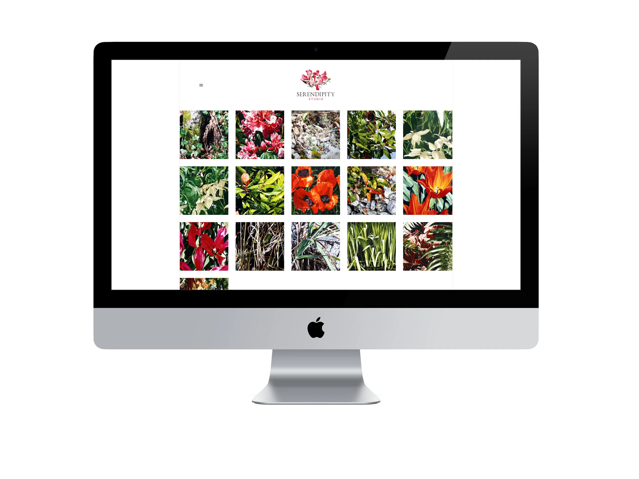
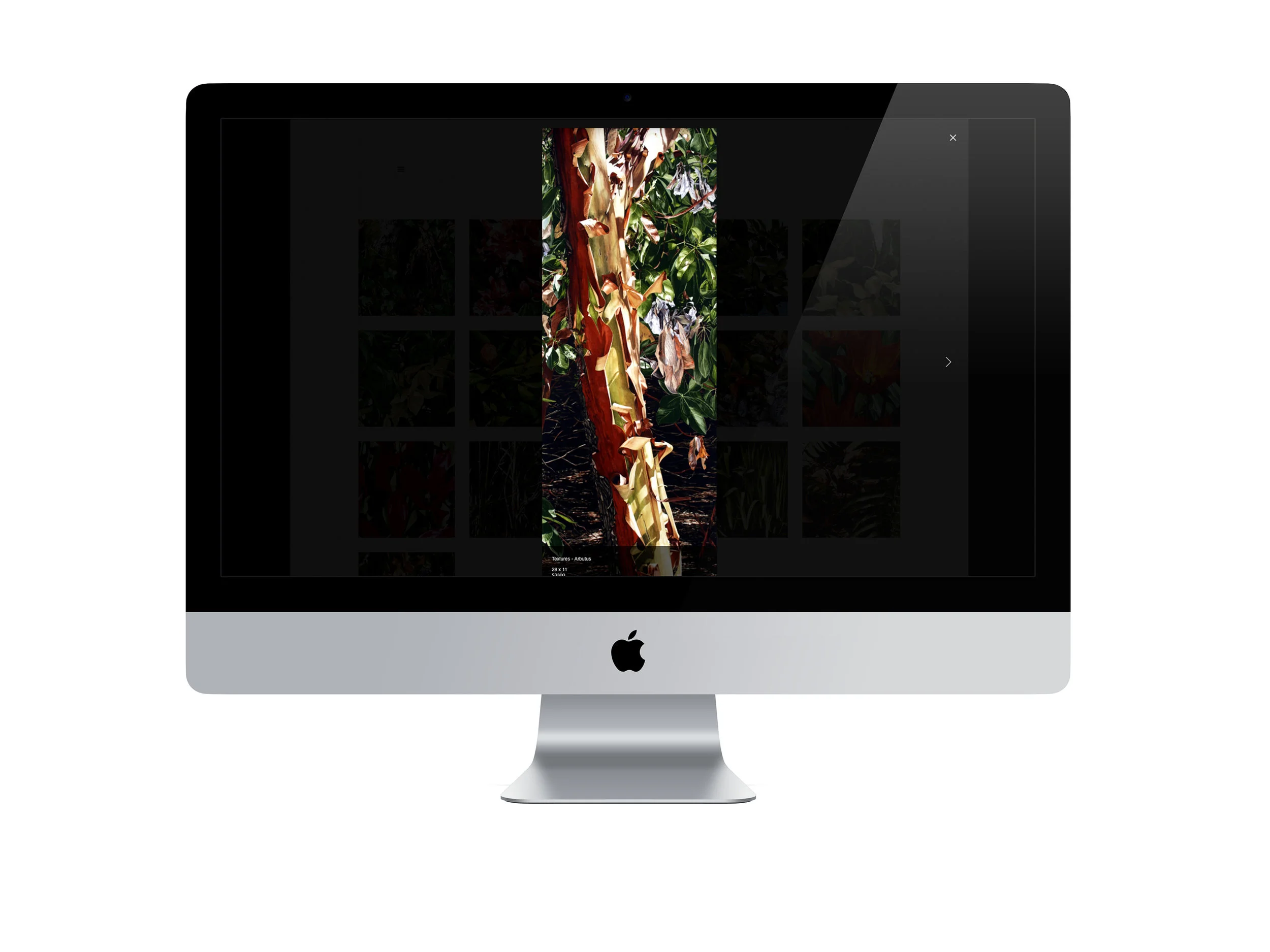
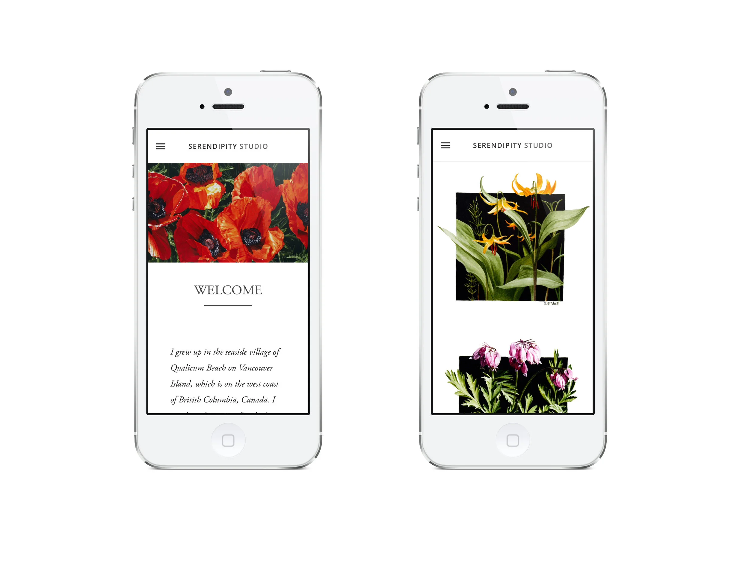
As a follow-up to Serendipity Studio’s logo, sherrymitchell.ca was the result of a desire to create a beautiful website where Sherry could present her work. We both agreed that, like a high-end art gallery, the site needed to allow the work itself to jump out at the viewer. With no distractions and a heavy use of white-space, the result is dramatic.